Farm Africa brand guidelines
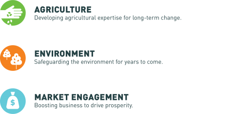
Farm Africa is a leading NGO specialising in growing agriculture, protecting the environment and strengthening markets in rural Africa.
Our brand is a reflection of the personality, vision, mission and values of our organisation.
These guidelines will help you understand what our brand stands for, and how it should be used to communicate consistently and effectively. You will find information about the different components that come together to form the Farm Africa brand and full guidance on what to do with them. This is also the place where you will find all brand assets, to be downloaded as and when you need them.
Download a PDF version of Farm Africa's brand guidelines (PDF 2MB)
When writing, please also refer to the Farm Africa style guide.
Our mission
Our vision
Our values
Farm Africa boilerplate
Tone of voice
The Farm Africa logo
'In aid of Farm Africa' logo
Colours
Wave assets
Typography
Iconography
Our mission
To promote sustainable agricultural practices, strengthen markets and protect the environment in rural Africa.
Our vision
A resilient rural Africa where people and the environment thrive.
Our values
- EXPERT: Expertise and insightful evidence-based solutions are at the heart of everything Farm Africa does.
- GROUNDED: Our teams and partners work closely with local communities, engaging them in every level of decision-making.
- IMPACTFUL: We deliver long-lasting change for farmers, their families and the environments they live in.
- BOLD: We model innovative approaches and are not afraid to challenge strategies that are failing.
Return to the top of this page.
Farm Africa boilerplate
All Farm Africa publications should include the following if space allows:
Investing in smallholder farming is the number one way to combat poverty in rural Africa. Farm Africa is a leading NGO specialising in growing agriculture, protecting the environment and strengthening markets in rural Africa.
Tone of voice
Our tone of voice expresses our character, energy and vision and is therefore an important consideration for anyone creating materials for the organisation.
The tone of our writing style will naturally vary depending upon the audience we’re talking to. For instance,
fundraising copy might be more emotional and inspiring, while copy for an impact report or case study might be more
factual and dispassionate. The copywriter must be sensitive to who the reader is.
Nevertheless, just as our designs utilise particular elements of colour and typography, so our copywriting is oriented around some consistent themes important to our brand.
Tone of voice key points:
Vision and inspiration
Farm Africa is driven by a shared vision of how Africa’s farmers can deliver solutions for Africa’s people. It’s a vision
that is both inspiring and achievable and it’s important our writing reflects this without over-stating or becoming grandiose.
Knowledge and experience
Farm Africa speaks with an authoritative and confident tone that reflects our experience in the field. While we need to demonstrate that Farm Africa knows what it's talking about we don't want to baffle people with science and policy.
Personal and passionate
Our work may at times be technical, but our spirit and energy is always personal. We can talk policy and practice when we need, but we also give our writing a human feel.
On the frontline
Our on-the-ground, frontline ethos is an important part of the Farm Africa story. We need to connect readers with the experiences of farmers and tell our story in a way that has understanding and empathy.
Real results
Farm Africa is an organisation that makes a difference. This energy and dedication to action and results is essential to who we are so we need to show how and where we've made a difference. We need language that is active, dynamic and determined. And we need punchy facts that prove how our work changes lives. For example:
- Increased yields from (X) to (Y)
- Increased household income from (X) to (Y)
- Increased value of crop sales
- Increase number of children at school
- Increased number of livestock
- Increased size of smallholding - investment in more land
- Improved living standards eg better house/closer source of water
- Reduced greenhouse gas emissions
Tone of voice sample messages
Farm Africa’s key messaging will keep evolving. Some messages, particularly around our vision, are a pithy encapsulation of who we are. Others have a more personal story attached to them. It will be important to keep developing new messages for the organisation so our communications remain fresh and engaging.
- Driving prosperity through agriculture.
- Making conservation profitable.
- Getting markets moving.
- We unlock the potential of agriculture to transform rural Africa.
- From livestock to loans, we empower Africa’s rural entrepreneurs to achieve more.
- Our work kickstarts rural economies.
- Grow Africa’s future, from the ground up.
- We help farmers make a profit not just this harvest, but every harvest.
- Empowering farmers to grow more, sell more and sell for more.
- Helping rural communities thrive, while protecting the environment.
- Trust us. This is what we do best.
- Protecting land. Protecting livestock. Protecting futures.
Return to the top of this page.
The Farm Africa logo
Download the Farm Africa logo in all colours - JPEG
Download the Farm Africa logo in all colours - EPS
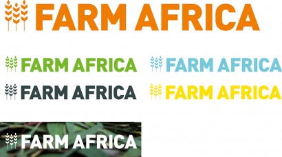
There are five different colour versions of our logo - FA Green, FA Orange, FA Blue, FA Grey and FA Yellow. To maintain the bold, fresh, nature of the brand, our logo colours should be considered interchangeable and equal - there is no ‘primary’ colour - use whichever is the most appropriate and sympathetic to the job. It is also possible to use a white-out version of our logo on top of suitable images, but please always ensure that the image used is dark, to aid legibility. When our logo is featured on partner materials or in our own mono-colour work, our logo can also appear in solid black, but this should be avoided.
The logo - exclusion zone
![]()
To protect the clarity and visual integrity of the logo, an exclusion zone has been designated. We calculate the minimum exclusion zone around our logo based on the uppercase ‘F’ from the ‘Farm Africa’ element of the logo. The one exception to the exclusion zone rule is when it is ‘locked-up’ to work below our graphic messaging holding device. In this situation, the holding device sits above the logo at the exact distance equivalent to twice the width of the 'i' from the Farm Africa element of the logo.
The logo - recommended and minimum sizes
![]()
We have outlined some recommended logo sizes to be used at various formats Our logo must be clearly visible and reproduced consistently across all media. For this reason a minimum size has been established. These are shown to the left and should be followed at all times.
The logo - misuse
![]()
Our logo has been specially created for us, so please don’t alter it in any way. All elements are intrinsic to our logo and should not be removed or changed. Shown here are just a few of the myriad ways in which our logo could be misused - please avoid ANY change or alteration to master logo files supplied.
Return to the top of this page.
'In aid of Farm Africa' logo
We have produced an 'In aid of Farm Africa' logo for use by organisers of events or activities that are 'in aid' of Farm Africa but are not run by our staff or form part of our official events programme. Please distribute these to anyone who needs them, and remind users that their materials need to make clear that they are fundraising for us, but that they do not represent the charity.
Download all 'In aid of Farm Africa' logos - JPEG
Download all 'In aid of Farm Africa' logos - EPS
Return to the top of this page.
Colours
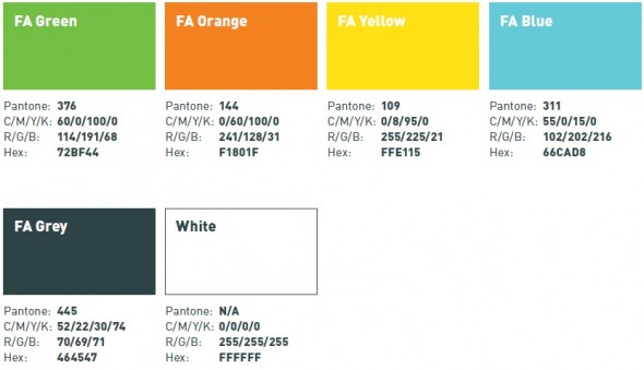
When using colour choose the correct version for the relevant media. Use Pantone or CMYK colours in print applications and RGB or Hexagraphic colour values for online applications.
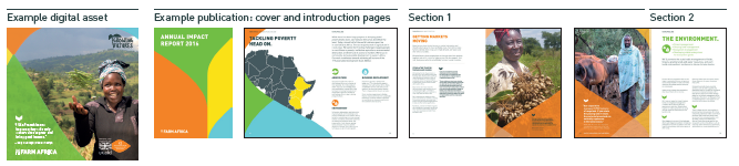
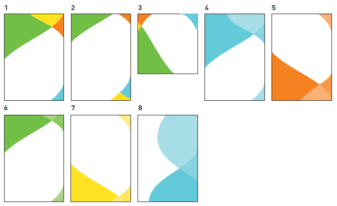
On introductory pages of publications, digital assets or for one-off pieces about Farm Africa a combination of the four brand colours should be used.
Within a publication, one brand colour should be used per section of content. If one section ends on a left hand page, and the next starts on the right hand page two colours can be used in the same spread. The brand colours should be considered interchangeable and equal.
Return to the top of this page.
Wave assets
Download all Farm Africa wave assets - JPG
Download all Farm Africa wave assets - PNG
Download Farm Africa combination wave assets - EPS
Download Farm Africa orange wave assets - EPS
Download Farm Africa green wave assets - EPS
Download Farm Africa blue wave assets - EPS
Download Farm Africa yellow wave assets - EPS
There are ten crops of the Farm Africa wheatsheaf icon that can be used as photo borders, text boxes and photo boxes in Farm Africa collateral.
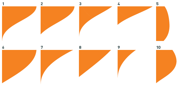
The waves can be combined, with combinations of all four brand colours used for introductory pages, front covers and stand-alone pieces, and individual brand colours used along with 60% and 80% tints of that colour for photo borders and textboxes within Farm Africa reports.
Return to the top of this page.
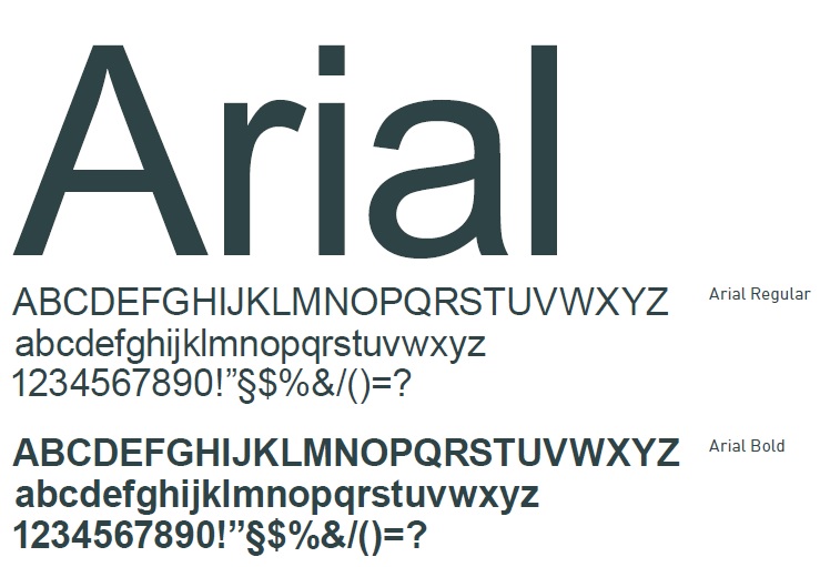
Typography
Primary typeface
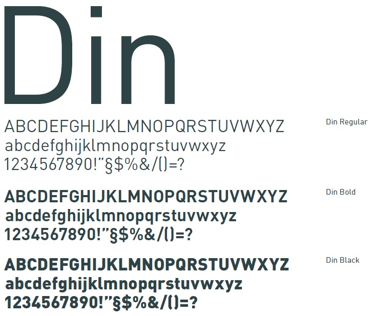
Din is the primary typeface of Farm Africa. We use three different weights for emphasis and distinction: Din Regular, Din Bold and Din Black.
Secondary typeface
In situations where Din is unavailable and/or for internal usage and communications such as email. Arial should be used. Arial Regular is used as a substitute for Din Regular. Arial Bold is a substitute for both Din Bold and Din Black.
Typography - alignment and leading
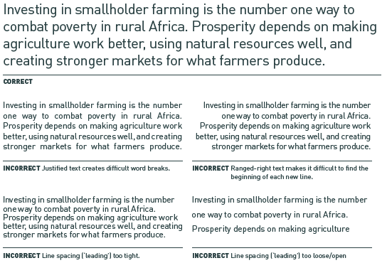
We recommend that in all situations typography should be aligned left. This provides the eye with a constant starting point for each line, making text easier to read.
Line-spacing (or ‘leading’) should always aim to measure at least 120% of the point size used to ensure the best legibility.
The example paragraph shown here at the top shows both the correct alignment and the correct leading. The other examples are all incorrect, for the reasons shown.
Typeface - hierarchy
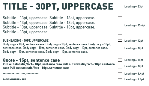
When a variety of type sizes and weights are used, the differences between them should be recognisable. Please note: the examples here are a guide only. Each job needs analysing individually. We would always suggest that body copy never falls below 9pt.
Return to the top of this page.
Iconography
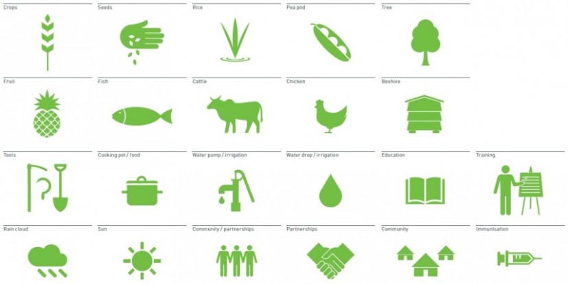
We have created a small library of bespoke icons for use in our materials. They should be used sparingly and should always appear in one of our brand colours, at a 100% solid tint. They can be used singularly or in repeat, but you should not use multple icons together to create an illustration or ‘narrative’.
Download all Farm Africa icons in green - JPEG
Download all Farm Africa icons in orange - JPEG
Download all Farm Africa icons in blue - JPEG
Download all Farm Africa icons in yellow - JPEG
Download all Farm Africa icons in grey - JPEG
Download all Farm Africa icons in white - PNG